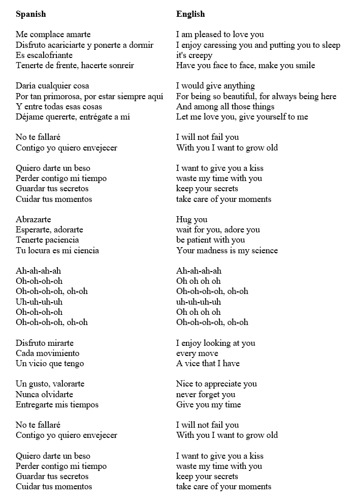
Song 'Disfruto' from Carla Morrison: here. Beautiful and sentimental for me.
Tuesday, October 25, 2022
Tuesday, October 18, 2022
Orange Cars in The Netherlands
How the West was won and you nevertheless end up (temporarily?) with Trump? We'd better ask: how did we visualize data the past 500 years? Michael Friendly distinguishes the following eight milestones:
"It is harder to provide a succinct overview of the most recent developments in data visualization, because they are so varied, have occurred at an accelerated pace, and across a wider range of disciplines. It is also more difficult to highlight the most significant developments (and because we have focused on the earlier history), so there are presently areas and events unrepresented here.
With this disclaimer, a few major themes stand out:
• the development of a variety of highly interactive computer systems and more importantly,
• new paradigms of direct manipulation for visual data analysis (linking, brushing, selection, focusing, etc.)
• new methods for visualizing high-dimensional data (grand tour, scatterplot matrix, parallel coordinates plot, etc.);
• the invention of new graphical techniques for discrete and categorical data (four-fold display, sieve diagram, mosaic plot, etc.), and analogous extensions of older ones (diagnostic plots for generalized linear models, mosaic matrices, etc.) and,
• the application of visualization methods to an ever-expanding array of substantive problems and data structures.
These developments in visualization methods and techniques arguably depended on advances in theoretical and technological infrastructure. Some of these are: (a) large-scale software engineering; (b) extensions of classical linear statistical modeling to wider domains; (c) vastly increased computer processing speed and capacity, allowing computationally intensive methods and access to massive data problems.
In turn, the combination of these themes and advances now provides some solutions for earlier problems."
I've no idea in which category this visualization (What colour do cars have in The Netherlands in year 2022) falls - it was already used by the CBS in 1961 - but I think it is very strong:
Source 1: Michael Friendly, 'Milestones in the history of thematic cartography, statistical graphics, and data visualization' (2009). Here
Source 2: Statistics Netherlands (CBS), 'The Netherlands in numbers: infographics inspired by 36 questions'. Year 2022. Here


.png)


